I always really enjoy the module of PPP, this is mainly because it is pretty self directed. This year I have particularly enjoyed it though because it has allowed us to figure out who we are as animators and individuals. It's been a great help for people like me who at the beginning literally just thought of myself as a guy who animates. Well what this module was to me was the opportunity to take stock and look at all the work I had produced and am producing and figure out how I can basically show it off and present it. Furthermore it has been a unique chance to do stuff I feel is pretty important as an animator.
One part of this module in particular that I feel has been very beneficial to me is creating an ident. I love the idea of putting an ident or logo on anything I create. It makes my work look less random and more professional. It's like if I'm showing someone an animation now it's less like I'm actually showing them just an animation and now like I'm showing someone a Max Ardron animation which for me is pretty cool.
Last year I hardly spent anytime at all on my showreel, I think it took me soothing like ten minutes to produce and I did not take into account anything such as timing or editing. I don't think I even put any music to it. But this year I took this a lot more seriously. I regretted not putting in more effort to the showreel last year as it is important. It's all the work you've created in a year and I'm pretty proud of a lot of the work I have created this year so obviously I wanted to show it off in a way where the showreel is an enjoyable experience to watch in of itself. So this year I spent a lot more time developing it and made sure to time it to music. I even made two showreels, one that contains all my second year work. And I also created one that is essentially an update of my first year showreel, containing work that I have created in the past two years that hopefully I will be able to update every year with new stuff.
This year's PPP has also been beneficial to me because it has forced me to sort out my online presence. I have always used social networks to post my work. But to be honest I would often neglect them. This year I was originally slightly unwilling to sort this out as it seemed like a lot of effort and a bit of a waste of time since I felt it was taking time away from me working on actual projects. But as I got into it I found it to be very rewarding and actually encouraged me to create more good work so I can show it off and further develop my portfolio that at the start of this year seemed limited but now seems to contain a lot more stuff.
Monday 16 May 2016
Otto Schmidt
So Greta introduced me to the artist/illustrator Otto Schmidt. I really like his work, it's often very sexualised but I don't see that as a bad thing. It's not like the imagery he produces is sexist, at least not in my eyes. The characters in his work are to me very bold and hard hitting. His work kind of reminds me of Jamie Hewlett's, in particular his style of drawing women, and drawing in general, using sharp lines and bright vibrant colours.
A lot of his illustrations I don't really understand, for example the below illustration Jewel in the Skull. I feel like it is supposed to be inspired by Macbeth but I'm not really sure, maybe that doesn't really matter, yet like Greta said to me when she told me it's one of her favourites, it's provocative. Perhaps that's why I like his work so much.
I take inspiration from Schmidt's work, when there's nothing provocative about an image that's fine but I find sometimes putting that into my work makes it more fun. I like to incorporate things like sex, drugs, anger and violence into my work because it stimulates a reaction from an audience. It's also a great way of taking my own anger out.


Pitch Perfect: Part Two Designing the Final Logo
Callum added his illustration techniques to the mix to see what he could do with the logo. The group liked the idea of incorporating fish into the logo since it fitted the name of Free Flow like a free flowing river for example.
INSERT LOGO WITHOUT TEXT
I really liked what Callum did with the logo. I particularly like that he did not include outlines, it makes the image appear softer and shows that as a company we are open to work with a multitude of different mediums.
INSERT LOGO WITH TEXT
When we added text I thought the font looked really nice. Unlike Malachi's text that looked very bold and hard hitting, again this font looked very soft on the eyes and complimented the name. The colours in the logo I also feel are a lot softer and less hard hitting.
Pitch Perfect: The Pitch
Callum put together a presentation of all the work we as a group had created for Pitch Perfect. It's worth mentioning here that Hayley had also set up a website for the studio that contained work from each of us. The pitch went very well, I felt like even though we were up against many other groups all with intriguing studio idea concepts. I felt like what made our studio stand out was the fact that we were open to stop motion animation of which few other groups in the class were. Stop motion was not the only reason, but it did make a good example of how we as an animation studio stand out from the crowd a bit and could compete in a competitive market.
Pitch Perfect: Part Three Designing the Business Cards
I'd never designed a business card before so I felt like after being given the task of designing business cards for our Animation Studio it might be a challenge. It's not even just a business card for myself. It's a business card for a whole studio so I needed to make it look as professional as possible. Luckily I had already been given most the ingredients to make business cards with the logo and brand name, colours etc. So my task was basically putting it together and making it look nice.


I liked the results I had created. Since I hadn't made business cards before I did look up business card templates on the internet so I could better understand how to lay mine out in a professional manner. It didn't take me too long to finish the final designs. This had me worried, I felt like due to how time consuming the animation process is that this should have taken me more time to do, but in the case of business cards, for sake of professionalism often less is more.


I liked the results I had created. Since I hadn't made business cards before I did look up business card templates on the internet so I could better understand how to lay mine out in a professional manner. It didn't take me too long to finish the final designs. This had me worried, I felt like due to how time consuming the animation process is that this should have taken me more time to do, but in the case of business cards, for sake of professionalism often less is more.
Sunday 15 May 2016
Pitch Perfect: Part Two Designing the Logo
We had figured out exactly what kind of thing we wanted to do with our animation studio. In that we wanted to set out to make short films, furthermore we felt we could stand out from the crowd because we were going to work in a range of different techniques and styles ranging from stop motion animation to more technical computer generated animations. One aspect of animation that we might not be so involved in would probably be 3D animation, this is because none of us are too comfortable with the medium.

Anyway once we had all this sorted it was time to design a logo. We also had come up with the name Free Flow Studio. I really liked this name as to me it rolled off the tongue and to the best of my knowledge I couldn't think of another company with a name like it.
Malachi was initially tasked with coming up with the logo, these are the initial designs he created...

(Photograph courtesy of Hayley Dalrymple)
I think we all liked Malachi's designs but the problem was that they didn't really fit the feel and tone of not only the name of the studio, but the studio as a whole. Unfortunately the top left designs also reminded me of a street sign. Furthermore I also felt the colours did not match the tone we were going for, they were too bold and hard hitting. I think we all agreed the colours we use for the logo should be a lot calmer. These logo's were also too basic, this is heavily down to the name we had fore the company at the time though, so this was swiftly changed.
Pitch Perfect
So Pitch Perfect was the name of this brief and we needed to get into a group and basically form an imaginary Animation Studio. Now if it was just going to be me, Callum and Malachi in a group together things could have either worked out fine, or gone horribly, horribly wrong, I don't think the others would mind me saying that. So luckily Hayley was also part of our group and she basically steered this ship. We began by filling out this task sheet, we all contributed, but Hayley basically wrote it up...
who would we pitch our idea/concept to?
cartoon movie festival -
commissioning animations to tv channels - look at process
how will we source work?
want to make own animation - get to festivals stripy bird
consider how to promote your self, what language do you use
ethical morals - environment, (different to other companies)
Who is your target market?
Distant Future
'We’re a creative animation studio, with the emphasis definitely on creative.
Duke studios leeds
Name for company?
Range of animation styles, 2d, stop motion, mixed media
Short films, entertainment
Business cards?
who would we pitch our idea/concept to?
cartoon movie festival -
commissioning animations to tv channels - look at process
how will we source work?
want to make own animation - get to festivals stripy bird
consider how to promote your self, what language do you use
ethical morals - environment, (different to other companies)
What skills and services do you have to offer?
Max - communicating, animation process, directing, voice acting, editing
Malachi - communication, design, up on technology, pre production and animating
Callum - background design, pre production,
Hayley - making, pre production, animating,
Who is your target market?
Young adults
Who is your competition and how will you compete?
Golden Wolf
'a solution-focussed production company based in London’s Shoreditch. Since opening our doors in 2013, our ever-growing in-house team has collaborated on a diverse range of projects for global brands as well as local ones. We are problem-solvers at heart, believing that every creative challenge should be approached with a tailor-made, bespoke solution.'
'a solution-focussed production company based in London’s Shoreditch. Since opening our doors in 2013, our ever-growing in-house team has collaborated on a diverse range of projects for global brands as well as local ones. We are problem-solvers at heart, believing that every creative challenge should be approached with a tailor-made, bespoke solution.'
Distant Future
'We’re a creative animation studio, with the emphasis definitely on creative.
Every project is different and our award winning team bring their combined expertise and unique perspective to deliver original and visually exciting animations.
It could be bringing a product life, making a presentation more entertaining or adding special effects to a video, we can even create a personality for an animated character: it’s all about making sure audiences remember their experience.
If you can imagine it, we can create it.'
Little Motel
'Little Motel Motion Studio is a Leeds-based independent post-production studio, focussed on creating tailored film & motion graphics, simply, for wherever it’s needed.'
Wonky
We work with an eclectic mix of talented creatives ranging from illustrators and model makers to writers and musicians. Our illustrators cover a variety of visual styles while our animators offer a wide range of animation techniques allowing us to develop a bespoke approach for every job. Being WONKY we look at digital media from another angle and are constantly looking at new ways to develop innovative new film experiences. Combining our design expertise with technology know-how we are able to offer various digital media services including web design and development, app design and online games.
With most of these companies, they don't use the technique of stop motion, so we would be different due the the fact that we offer a range of animation techniques and mixed media.
moral compass, support what we work for, (footprint, cooperative uk) sustainable recourses? flexible working,
moral compass, support what we work for, (footprint, cooperative uk) sustainable recourses? flexible working,
What are your costs, charges and financial considerations?
All chip in with own money?
Raise money?
Loan? Pitch to bank
Studio space
Software costs
Computer costs
Heating and electricity
Employee pay
How will you structure your studio?
Start out approaching authors/poets/writers etc, to animate to get known for business
Duke studios leeds
Who will be responsible for what?
Max - animator, character design, pitching, sound, editing
Malachi - hands on director, character design, pitching, editing, advertising/social media
Callum - producer, coffee boy, background/ character design, pitching
Hayley - financial stuff(to start), puppet/set making, sound, website/social media
How will you promote your services? To who? Using what media?
Business cards
Website
Instagram/ social media
Posters?
Ads online
look at other company logo. what do we want to communicate?
look at other company logo. what do we want to communicate?
To do:
Max - business card design
Malachi - logo design
Callum - presentation based on questions
Hayley - website design
Brand Me: Online Presence
So being one of the only Max Ardron's in the world for me is both a blessing and a curse. It's a blessing in that it's easy to get noticed on the internet, it's not like you have to scroll through endless google pages to find me, I'm generally the first result that comes up.

So this is what you get if you type my name in on Google Images. Luckily there is current work in there with the caricatures I occasionally do. But then there's also a photo of me from like six years ago and drawings I created so long ago that I now look back and just want to forget about them.


So this is what you get if you type my name in on Google Images. Luckily there is current work in there with the caricatures I occasionally do. But then there's also a photo of me from like six years ago and drawings I created so long ago that I now look back and just want to forget about them.
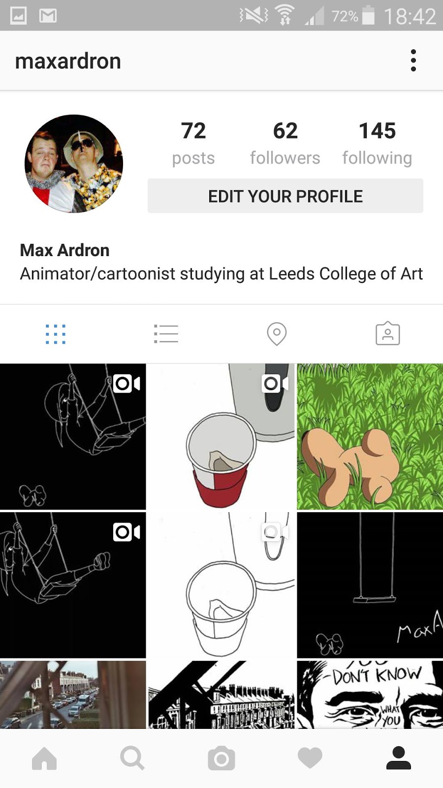
So above is my Instagram, the social media I probably use the most. I do use other social medias but to me Instagram is the most successful for a few reasons. Apart from not really being accessible on the computer it is very user-friendly and I can easily upload my work to it in seconds. Then I can tag my work with hashtags such as #animation and it reaches a much wider audience. Furthermore the layout is so simple. If I'm ever networking and someone would like to see my work I can easily whip out my phone and have all the work I am the proudest of view able within seconds.
Good Morning

Good Morning is a short animated film by Satoshi Kon. And my god it is short but no less amazing then any of his feature length films such as Paprika. With a run time of a minute, Good Morning is about a young woman waking up and getting ready for the day. THAT'S IT. Yet it's directed in such a masterful way where we as an audience can feel like we are getting up with her. I read an interesting YouTube comment that stated that in the animation it's like her body is awake before her brain is and as her second self slowly catches up with her and she becomes more solid looking it is her complete self waking up, just like how we wake up everyday in real life. Needless to say even though this is on;y a minute long, if I could make something anywhere near this good I'd die happy.


Brand Me: Visual Identity Ident
So with my logo sorted, it was time to create an ident. And again I decided to not overthink this but I still wanted an ident that looked very professional as I would like to use it on almost everything I make for the foreseeable future. I looked to what my fellow animators were creating and they all seemed to be developing idents that represented themselves in someway, whether that be their name or aspects of their personalities. Well I knew if I was going to create an ident it had to be traditional animation as that is basically the way I work. Furthermore if I was going to show this to an audience that knew my stuff the ident had to represent a great deal of the stuff I make.
This was a struggle to come up with because I don't really think I've found my visual aesthetic. I've always really liked the ident for Walt Disney Animation Studios. It is so simple, using Walt's signature handwriting for the name and Mickey Mouse, the most recogniseable part of the company and the mascot.

I decided to take inspiration from this and use the girl on the swing from my Swinging Through Time animation that I have been working on since the Processes and Production module in first year. The reason for this is because this animation has remained a constant throughout my working university life. I still always get asked about how the progress of the animation is going, and it's almost become a running joke that I'll still be working on the animation when I'm 70.
Furthermore I decided to use the girl as the logo because she is drawn in a way that other animators and other people recognise as my own work, e.g. the way I draw eyes. Plus I like the way she jumps off the swing, it's playful and fun and also like she's jumping straight into the screen ready to run off into a new adventure.


Brand Me: Visual Identity
I found this part of the brief pretty straight forward. It didn't take to long for me to come up with a visual identity for myself. I was resilient to do it, that being said because to be honest I enjoy this part of animation the least. I hate making myself stand out or acting as a brand. To me I'm just a guy who draws and animates, if you hire me, I'll just be myself, I wont be a brand. That's probably just me being stubborn and I don't want to put a downer on this brief as it is important. Anyway, I saw many of my fellow animators were giving themselves different names for their visual identities. Again I did not really understand this, wouldn't it be majorly confusing if everyone's called something different to who they actually are? I don't know any famous animators who use different names, again that's probably just me not understanding it again.
And to be fair I don't think I'm ever going to meet another Max Ardron in my life so I could just use my name but I understand if others have names that are more common they may not want to. But yeah, I could use my name because if you type that name in on Google it only really comes up with me.
Now, onto the logo. Again I decided to not overthink it, and I simply decided to just use the way I always see my name presented, in my own handwriting.

I know this looks like I've hardly tried but I feel as a logo it's successful, and it's not the first time I've seen someone use their handwriting as their logo...

The Blind Pipeline
The Blind Pipeline is a project I did that is entirely unrelated to anything at all. I was at a stage in the modules I was working on where I pretty much stopped caring about the work I was creating and my enthusiasm had hit a rock bottom. This has happened before in the past and rarely has this problem been solved by doing more of the same work. I literally have to find something else to do. That is when this happened. I'd thought about the idea for a while. The idea was to draw a picture, get someone else to copy the picture, then pass it on, the next person would draw the previous picture and so on.


I started by drawing the woman from the Chemical Brothers music video Setting Sun. For no reason, that just must have been on my mind at the time. Then the process began. I feel it's fair to say I got a little carried away with the project. Where originally I was going to get like ten people to do it, in the end I ended up getting a hundred people to do it from all different courses. The process was pretty time consuming as I decided to edit it together as an animation in itself and time it to music. I ended up using the song Roots by Romare and I really liked the results. So not only was the process of timing the images with music time consuming, but also was crediting everyone at the end. With the people I did not know the names of I had to track down various registers and for people I simply could not find the names of I had to just leave a little apology.
I really enjoyed this experiment and I like to think I might of broken the record for biggest collaboration on an art project at Leeds College of Art with a hundred collaborators.
https://www.youtube.com/watch?v=DAv3FVlDdQw
Paprika

Whoa what a film. I had pestered to watch it for quite sometime now but due to lack of time I simply never got around around to it. But as I believe I have stated before, half of animation should really be watching stuff, and not just animation, movies and TV shows in general. Because you shouldn't limit yourself to just animated movies because there are certain aspects of animation filmmaking that heavily crossover into live action and Paprika is a prime example of exactly that.
For example, when I watched the film of course I really loved it, although it did ruin the film Inception for me slightly.


So the above images should be enough to show how totally inspired Christopher Nolan was by this film when making Inception. Now, even though they cover similar themes, I must say I found Paprika to be way more enjoyable, now is this down to Paprika being an animated film or is this to do with the film's narrative? That I don't know. But Paprika succeeds for me in ways that are far beyond its visual aesthetic which is what I went into the film expecting to get.

Well the film's visuals are need I mention spectacular, but for me I found the experience of Paprika so enjoyable for many other factors. Firstly because watching Paprika is precisely that, an experience. The narrative confused me at times but to me I was not too fussed about understanding everything that was happening, I was pretty much happy to just go with it. There was never a moment I was even slightly bored, from the very first minute we as the viewer are launched threw a cannon into this bizarre amazing world. Coming out of the film I felt like I had just had an amazing dream, of course I was slightly knackered and didn't have too much desire to see it again immediately although this is a film you can watch again and again. Furthermore the characters are really good and when the film ended I was actually sad to leave them behind.

Subscribe to:
Posts (Atom)